West Village Energy Dashboard
The Problem
Design and build an interactive dashboard to inspire environmentally conscious behavior change among researchers in 4 office buildings.
My Role
I joined the WVED team when the team's ideation of the project shifted from tactile and "pushed" feedback to a digital interface made accessible in every participating office. I assumed the role of Lead Designer and on-boarded a peer, Belinda Huang, who assisted me to design the dashboard through the splash page and the horse mascots.
Background
West Village is a zero net community in Davis, California. Originally planned for retail, Tilia Square is filled with research centers housing labs, including Consumer Energy Interfaces Labs, cEnergi.
West Village Energy Dashboard (WVED) is a cEnergi project designed to display energy usage in comparison to the estimated zero-net energy goal. This feedback is a continuation of the West Village Energy Feedback project, which attempted to initiate behavioral change relative to energy usage and a modeled zero-net energy (ZNE) goal.
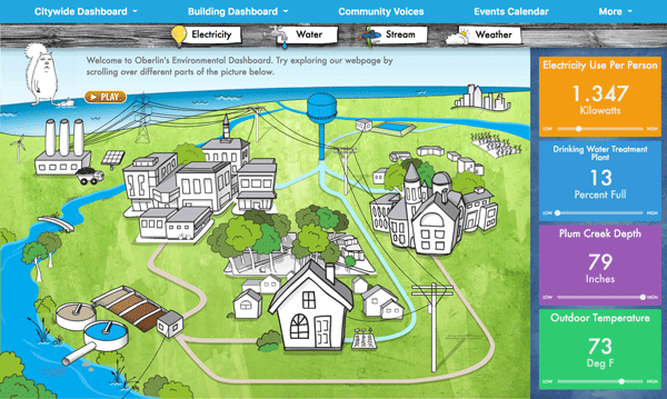
Oberlin’s Dashboard for inspiration
Research
We drew inspiration from multiple sources including Oberlin's energy dashboard. From previous studies on feedback's relationship to behavioral change, the team wanted to include empathetic gauges and gamification. We also conducted several focus group to analyze what data should be presented and how.
Insights
While the scientific academics who make up the majority of the offices wanted information in the form of graphs and data points, the staff wanted simplified data.
The animation of the tactile predecessor engaged testers and had a positive influence for sustainable behavior change.
How might we create a space for workers to understand their net energy consumption?


Concept
The dashboard consists of 4 displays of data. 1) a mascot whose emotions reflect the office’s current position on the leaderboard. 2) a weekly leaderboard that reflects the ZNE goal. 3) Power demand aggregated and instantaneous of different energy end-uses in relation to the solar generation. 4) Energy Usage as a percent of the ZNE goal. Each display uses the color scheme of red (more energy used than generated), green (more energy generated than used), and yellow (energy generated).
Testing
The first iterations of the dashboard didn’t show enough emotion with the mascots and leaderboard.
Data was hard to read and not complete
Functionality of data block #3 was confusing
It was ironic that the platform was demonstrating how to reduce energy, yet the design didn’t reflect energy-saving techniques


Solution
Create design in blocks so each one can be shifted for responsiveness.
Simplify dashboard
Add a “tour” of information option
Add toggles to flop on and off certain information
Simplify Splash screen
the grid
As a splash screen for the interface, our team was greatly inspired by Oberlin's dashboard map. We too wanted to graphically display how and where energy is being used.
After serious considerations, we decided not to disaggregate the energy consumption based on specific office desks as to not induce self blame or office tensions. This final map is designed by Belinda Huang.
the horses
Each building was randomly assigned a specific horse to be its mascot. The T-shirt coloring is based on an individual office's progress relative to the ZNE goal. The mascots have 4 facial expressions to reflect an individual building's status on the leaderboard. The horses were designed by Belinda as well.
Challenges
Establishing the back end data flow to understand how the data can be presented on the front end
Thinking about an interactive touchscreen TV as the primary interface and creating in a responsive manner that presents the data easily for desktop and mobile users.
Moving Forward
Talk to users to evaluate effectiveness of disaggregation features and leaderboard
Analyze if behavior change exists